Using Flash for Indoor Photography

aux flash

I have to admit it. Flash is my least favorite type of photography. I suppose since it seems so technical and the results can vary from situation to situation, looking artificial, too dark or too washed out. Luckily, today’s flashes can run pretty much on auto pilot and can be used for creative effect with just a little practice. But this time of year, and for the next four or five months, we’re all stuck indoors a great deal of the time, especially during the holiday season when we take so many candid photos at get-togethers. So I thought I’d share just a few basic flash tips to improve your indoor photos:

1) Your pop-up flash, the one that is part of the camera and pops up automatically if you are shooting in the “green box” total program mode, can cover just a short distance. Most of the time, any subject further than ten feet cannot get enough of the flash illumination for a properly exposed shot and that is why they look dark. You can boost your ISO to higher than normal (try 800 or 1000) to try and get more reach.

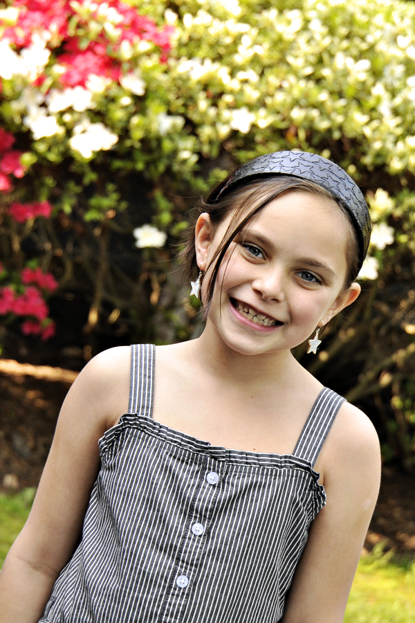
2) When you position your subject too close to a wall and use your pop-up flash, you are bound to get harsh shadows behind your subject. Eliminate this by having your subject step a few feet away from the wall and by shooting from a little bit above the subject (which is also a more flattering angle for portraits).

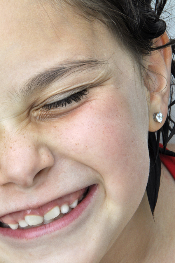
3) Your pop-up flash can cause red-eye quite often. This is because the flash is so close to the lens. It is worse on point-and-shoot cameras than DSLR cameras, but typical in either case. To eliminate red-eye, you can use the red-eye reduction function that throws out a pre-flash to make your subject’s eyes close down, but I find often that people think you’re done and move before the photo is actually shot. You can also try turning up the lights in the room to help the iris naturally close down a little.

4) If you are in a very dark room, the camera/flash may over-expose your subject (you know, the white face that appears to have nothing but eyes and lips) since the camera reads the room as very dark and wants to make it brighter. This also happens if you are too close to your subject. One solution is to back up to correct the latter, and turn up the room lights if you can for the former. If you cannot control the lighting, try moving your subject closer to a room light like I did above.

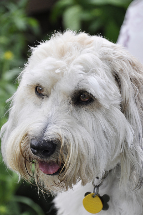
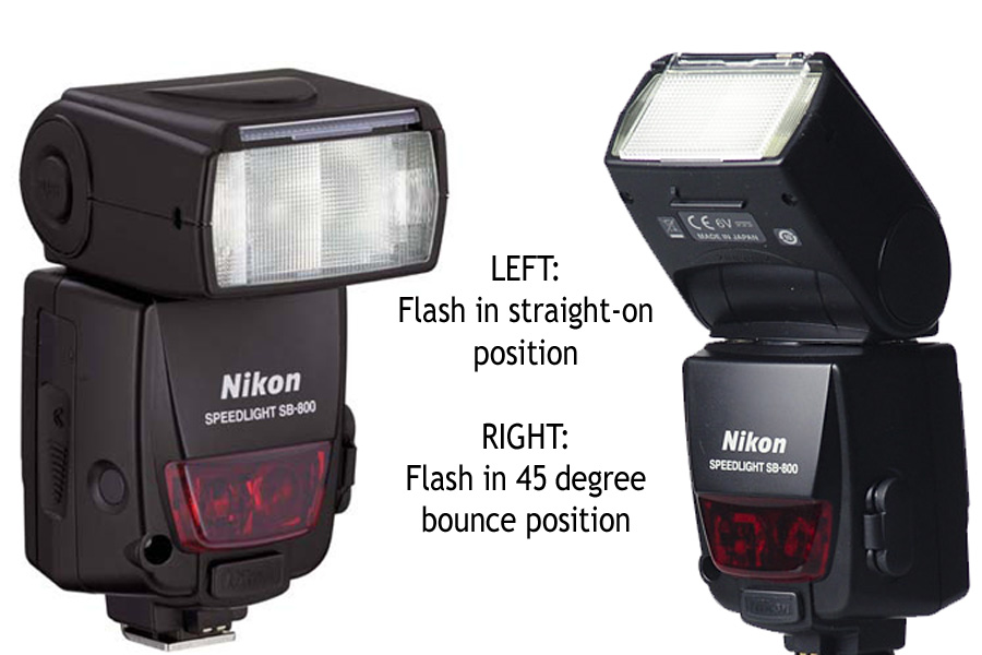
An on-camera auxiliary flash, like the one for my camera shown above, elevates the flash away from the lens and helps to reduce red-eye dramatically. This type of flash also helps in other ways: a) it can throw the flash further allowing you to be further away from your subject; and b) you can change the position of the flash to get more even lighting with much less shadows. This is called “bounce flash.”

{bounce flash}

{bounce flash}

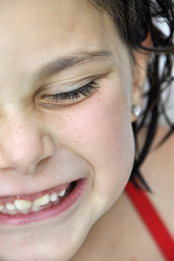
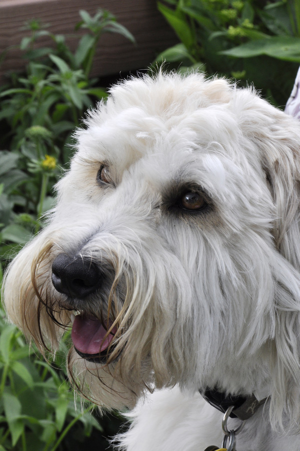
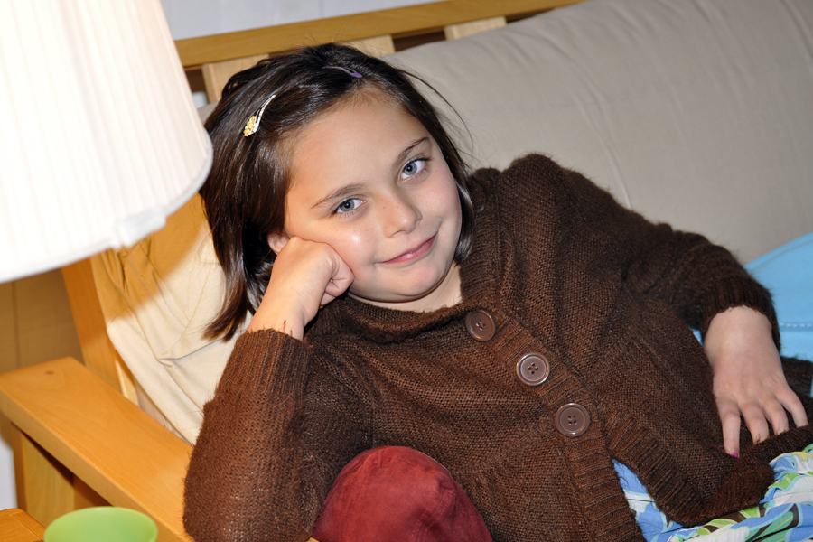
The photo above of my very Thanksgiving-weary subject was taken with the auxiliary flash in a bounce position. The flash bounced off of the ceiling and back down onto my subject. You can see the lighting looks much more natural and softer than in either of the two photos below where the shots look more artificial and harsh. In the photos below, you can also see the harsh shadow under the lamp and on the futon frame. And, there are hot spots on her cheeks. You can also see how quickly the flash “drops off,” meaning the couch gets darker, whereas in the photo above, the couch and subject are all evenly illuminated since the bounced flash showers the whole area with light. One caution–always bounce off of a white wall or ceiling as the flash will take on the color cast of what it is being bounced off of (e.g., a green ceiling will produce a ghoulish effect).

{pop-up flash on camera}

{pop-up flash on camera}

{straight-on auxiliary flash}

{straight-on auxiliary flash}


Like learning how to control your depth of field to blur backgrounds, mastering your flash is a must for anyone who is looking to take better people photos. So this season, try to remember some of the tips above when shooting your flash candids at family gatherings. And if you can get an auxiliary flash made for your camera onto your wish list, it will be a worthwhile investment for many years.

Change Your Position for Better Photos

shoot from above
Just like changing the scenery can give us a whole new outlook and change our mood, so does changing your position when taking a photo. It is very common for all of us to just shoot pictures from a standing position, but this leads to somewhat boring images. We have all gotten a much better shot just by crouching down or standing on a chair or bench. Not only do you get a whole new perspective, but this helps to eliminate distracting backgrounds for a clean, more professional look. For this shot, I was standing on the bulkhead while my subjects were down on the shore, allowing me to give a real sense of where they are since I was able to show both the sand and the beach grass in the shot. Plus, the busy background harbor was now out of the shot. Look for the next photo tips card download about positioning yourself for better photos to come shortly (see previous photo tips cards: #1 here; and #2 here).

Take a Photo that Demonstrates the Rule of Thirds

_DSC4304_RT_150

The rule of thirds is one of the most powerful creative options you have when composing your photograph. A photo that has the important element of the photo at an intersecting point of a “tic tac toe” board, or in one of the right or left, top or bottom thirds of the photo, is one that is more compelling  than a shot with the subject centered.

_DSC4304_RT_150_wgridMost often, you don’t want to position your subject smack dab in the center of the frame. It’s boring. Although, this rule, like all rules, can be broken very effectively. That really depends on the shot. But if you start to think about not putting you subject in the center of the frame, you will train your eye to see better shots. For example, the eye closest to the camera should hit one of the intersecting points. Or the critical part of the landscape should be in the top third or bottom third, left third or right third. My shot here shows the subject off to the right slightly and in the lower portion of the frame. This gives the subject breathing room in the frame, the “white space” (which does not have to be white, but rather unimportant or non-distracting space in the frame) gives your eye a place to rest and then come back to the subject, and by positioning the subject as I did, you get a feeling of where she is and that where she is important to me and therefore should be to the viewer as well. Below is another example. This time a vertical landscape that also adheres to the rule of thirds. I added the tic tac toe board to both images also so that you can get a better idea of where the intersecting points or thirds of a frame are.
_DSC4279_RT_150 _DSC4279_RT_150_wgrid

Use Your Flash for Outdoor Photos

fill flash_blog post

We all have heard the rule that early morning and late afternoon are the magical times for talking photos. But let’s face it. At noon, we’re at the pool or the beach. Noon is when the action is happening and when we are more likely to be taking photos. So in order to avoid the raccoon eyes that come with overhead noon time light, just turn on your flash! The small burst of light will fill in shadows and make your subject’s eyes pop out just like it did for my subject. Look at the shot on the left with no flash. Harsh shadows fill in the eye sockets and the shadow is strong across her shoulder and neck. For the shot on the right, I just popped up my built-in flash and it makes a world of difference. To avoide over-exposing your subject, one trick is to dial in a small aperture like F/16 or F/22. For some people, images that use fill flash may appear to be too artificial. If you find the flash puts out too much light, there is a setting on most DSLR cameras whereby you can “compensate” the flash in a plus (+) or minus (-) direction. Dial in a -1 or -2 flash compensation and the flash will emit less light to fill in shadows more subtly. (For that tip, however, you will have to break out your camera manual to find the setting). So next time you’re at the pool or beach this summer, and you cannot get your subject under an umbrella, or tree or some other type of open shade during those harsh hours between 11am and 3pm, then try popping up your flash! (25mm; F/16; ISO200)

Don’t Leave Home Without Your Camera

NYC_STORE_1That’s of course one of the tricks to getting a good photo. Just keep taking pictures! But even when your doing some of the most mundane things, you might just find some perfect light and a child with a great attitude for the day! Here are two shots from our recent overnight in NYC. We went window shopping down in SOHO and while in a furniture store, she sat down while we browsed. When I checked on her, I noticed that the window light streaming in from the high broad windows was beautiful. Her eyes just sparkled when she looked up at me. Of course, I said, oh, you look so pretty, stay right there! The warm tones in the store made it even more beautiful and she cooperated for two or three shots. (32mm; F/5; ISO 400).

NYC_STORE_2
At the next store, there were floor to ceiling windows all around the 2nd floor store. And she picked up a nice prop- a bouquet of artificial sunflowers – and promptly sat on the floor in front of the window. Because I was so close to her, not more than five feet, and used a focal length slightly more than normal (65mm), the flowers are out of focus. (65m; F/5; ISO 400). For both shots, I had my camera in aperture priority mode so that I could always pick the most wide open aperture I could get given the lighting. This way I ensured the background would be a little softer to make her pop out. And I always focus on the eyes (or the eye that is closest to the camera).

Photoshop 101 Color Correction

I am no Photoshop guru. Everything I know I learned from photographers Ken Hubbard and Andre Costantini, two pros who DO know their Photoshop. But I can fix a shot that’s too dark, or the wrong tint. Sometimes sharpen it up a bit. The thing to remember with digital is that almost all images need a little boost. If you send your images out to a lab to make prints (like Shutterfly or any other online processing) or drop them off at a drug store, the images automatically go through processing to increase contrast, correct a little color and sharpen them. But if you print at home like me, it’s worth the little bit of time to take a great shot and make it even better. Software like Photoshop Elements, Picassa and more are a great investment of both time and money. I noticed my shot of her in the pool from Sunday’s aperture post was looking a little blue. So I took a moment to fix it and thought this would be a good post. Here we go…

Step 1: Go to Edit > Adjustments > Levels (Ctr+L) and move your slider on the right until you meet the black hill. If need be, move the slider on the left to meet the black hill, too.1_levels
Step 2: Next, I zoomed in on the photo and went to Image > Adjustments > Curves (Ctr + M) and clicked the eyedropper on the right (white) and selected a white point in the photo (the rail of the pool in the background). The image now shifted color and became brighter.
2_curves
Step 3: However, I thought it was too bright. So I went to Edit > Fade > Fade Curves (fade will adjust the opacity of whatever your last action was) and selected 50%. I like the difference. I think the retouched version pops a little more and it not so blue.
5_after-before

Unclutter Your Photo’s Background

earring_F6_150

Understanding the function of F-stops, or the aperture of your lens, is undeniably the most confusing of your DSLR’s features. However, once you master it, you will make a huge leap forward in the quality of your photos.

As a photo student in high school and college, I stuck a slip of paper onto the back of my camera (yes, in film days SLRs had a bookplate slot on the back of the camera where you slipped in a flap from your film box so that you could remember what film you had loaded. Can you imagine?!). On this slip I wrote, “open aperture=blurry” and “small aperture=sharp.”

An open aperture lets in a lot of light. On your lens it is a setting like F/2.8, 3.5, 5.6, or 6.3. Think of the aperture as your eye’s pupil. If there is not much light, your pupil gets bigger, or “opens” to let in more light. But a big result of using an open aperture is the effect of a blurry background that really makes your subject pop off the page (or screen). You can easily control the aperture setting on your camera by putting the camera on “A” and dialing in one of the aforementioned numbers. Your camera will automatically pick a shutter speed to make a proper exposure.

If you have a distracting background, dialing in a wider (or open aperture) will make the background blurry and eliminate the distractions. However, maybe you want the background really clear. Like if you’re standing in front of a sign that you want to be able to read in the photo. Then you would dial in a small aperture.

In this first photo, her eye is in focus, but her earring is not, and neither is the tip of her nose. I was just a few feet away and had the camera set to “A” (Aperture Priority) and dialed in F/6.3. Now conversely, if you choose a small aperture, like F/22 or F/32, your background will appear more sharp. Again, imagine a bright sunny day and how your pupils react: they get smaller and let in less light. But also, think about when you squint and how things get clearer. This is sort of how a smaller aperture works. In the second photo, I dialed in F/32 and her earring is now in more focus.

{F/6}

{F/6}

{F/32}

{F/32}


{F/6.3}

{F/6.3}

{F/22}

{F/22}

Too Much Tilt In This Photo? Yeah, You’re Right.

Yes, too much leaning to the right. Or is that the left? But I love the expression. It is so hard to get natural expressions from her these days. I am sure this is true of all kids her age.

TOO MUCH TILT

They become more self-conscious. More goofy. They think they’re Miley Cyrus posing for CD cover (check out the tween star earrings I let her wear on weekends now). So this was a shot in-between the aforementioned less than desirable looks/poses. I just love her face. And the color! Posed in the shade of the garage in front of the sunny and colorful azalea bushes, she pops off the background. To get this effect, I set the camera to aperture priority and opened up to F/5.6 (my widest opening on this lens, at this focal lenth, in this light, at this ISO). Setting your camera to the portrait scene mode would give you a similar result. The wide open aperture makes the background blurry and soft. But I’ve got to admit it, my attraction to tilting (seeMarch 13 post) did not work out in this photo so much. I’ll try tilting it back a little in photoshop. But love the smile and that’s what really counts. (F/5.6; 1/125 sec; 400 ISO; 60mm with VC on).

Eggs-tra Fun Weekend for Photos

_DSC1188_RT

Like millions across the country, we dyed eggs this past weekend. And took pictures of the whole process. I have about 5 years worth of egg-dying photos now. (I see a big scrapbook collage with lots of 2×2 photos in my future). And each year I try to capture the one with the egg in focus and her face in the background smiling as she shows off her masterpieces one by one. Well, I got the egg in focus, and she’s nicely out of focus in the background. But no smile this year! I set my camera to “A” (aperture priority) and dialed in the widest aperture opening I could (f/5.7 at 97mm) so that the in front of and behind my subject (the egg) would be out of focus. I had my ISO turned all the way up to 3200 so that I would not have to use a flash. I like the result. And the egg went on to be further decorated and then promptly turned into a deviled egg!

To Tilt or Not To Tilt Your Photos

DSC_0439_soccer-awards

I admit it. I am a tilter. I just love the little feeling you get that this is a moment captured rather than a posed shot (even when it is, like this one after she got her 6th sequential soccer award–well, every player gets one every season, but special to her nonetheless). To me, slightly or moderately tilting the camera gives the picture energy. The other benefit of tilting is that if you, like me, hardly ever hold the camera really straight (making my images sometimes look a bit “off”) no one notices that the image wasn’t straight to begin with. So I just go with my natural tendency to tilt and use it for effect. Now many people feel tilting is over-done. And it can be. And there is certainly a time when it is not appropriate and can ruin an image. But I like it. And I’m sticking with it. For now. (ISO 800; 55mm; F/4.8; no flash; program mode; auto white balance). PS-can you see the catch light in her eyes? It’s coming from an overhead skylight! So look around for a light source when you are figuring out where you want your subject to stand.